
IDENTITY
WHEN WE ALL VOTE
CLIENT WHEN WE ALL VOTE
AGENCY JOHANNES LEONARDO
DESIGN DIRECTOR JOSEPH DASARO
When We All Vote is a national, nonpartisan 501(c)(3) organization dedicated to increasing voter registration nationwide, especially in marginalized and underserved areas. Leveraging the star power of founder Michelle Obama and her celebrity friends (Steph Curry, Tom Hanks, and Jennifer Lopez to name a few), WWAV is bringing an accessible, youthful edge to the world of voter registration initiatives.
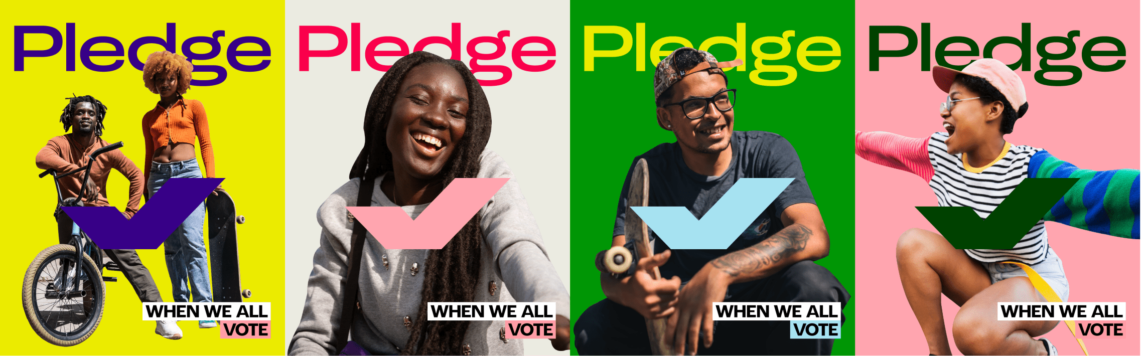
WWAV’s primary audience skews young and urban. Primarily people who's hesitancy to participate in elections comes from an experience of being underserved or outright neglected by the political process. Our goal was to create an identity for them that could acknowledge and speak to a wide array of diverse experiences while not feeling paternalistic or condescending.
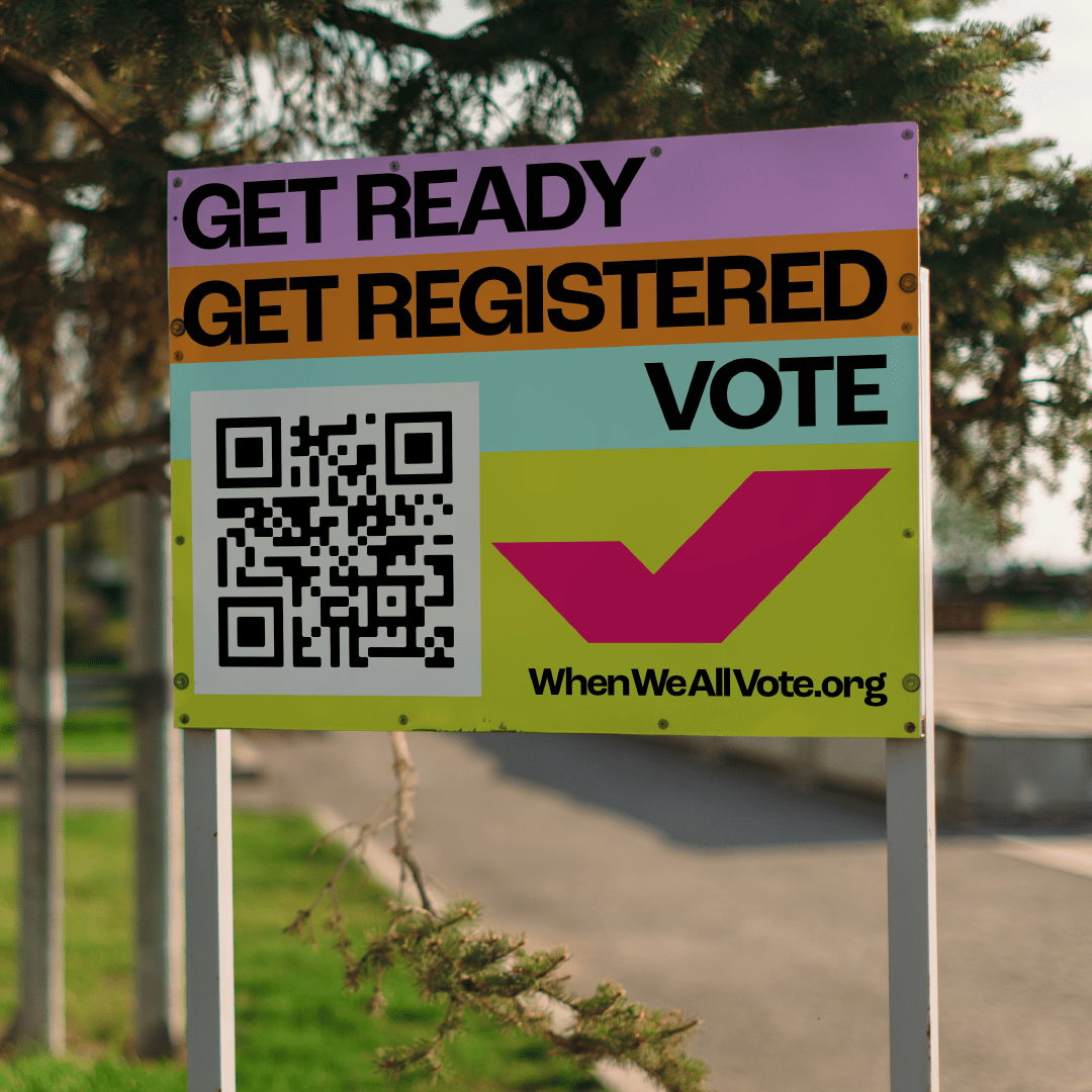
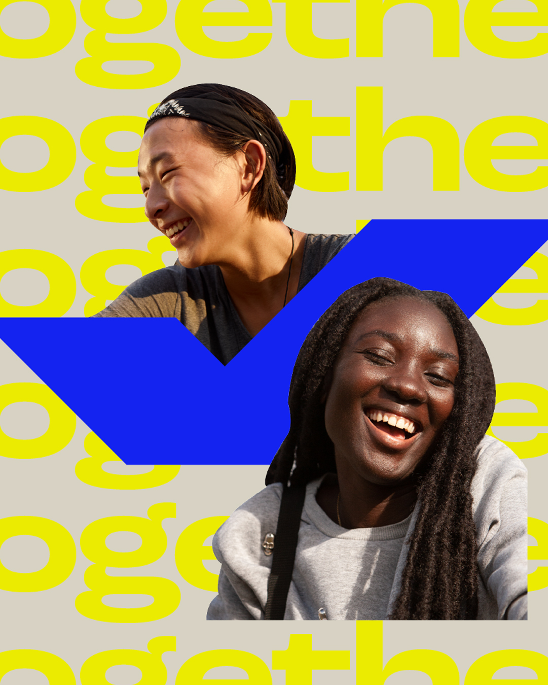
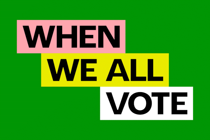
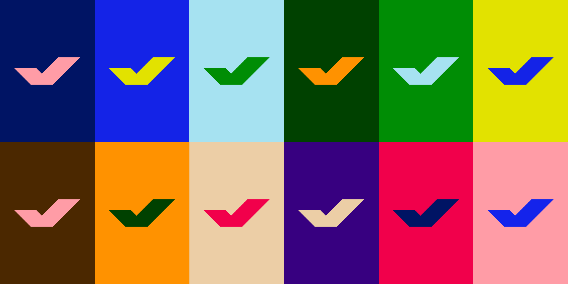
To this end we focused on creating a visual identity that celebrates a coming together of diverse perspectives, a contemporary and forward-looking portrait of the brighter tomorrow that can only be brought about when we all vote. Our first major decision on this front was to sidestep the traditional “brand colors” by opting for a wide band of bright punchy colors that can all be used interchangeably. In this way we emphasize the interactions between colors, rather than the individual colors themselves, as a recognizable brand element. By allowing our entire palette to share the same level of priority in our designs we nod to the diverse sociocultural fabric of american life that’s so core to WWAV’s mission.

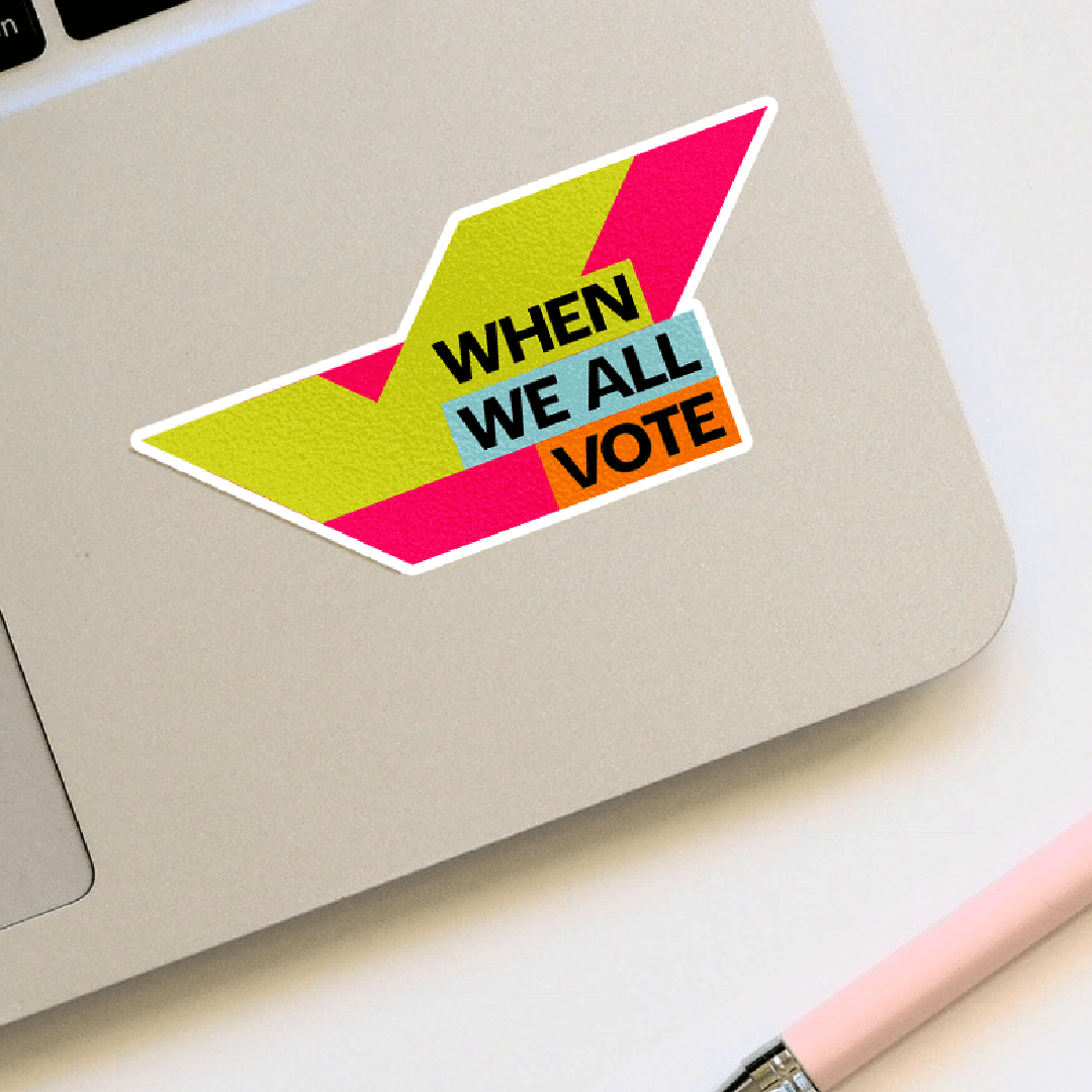
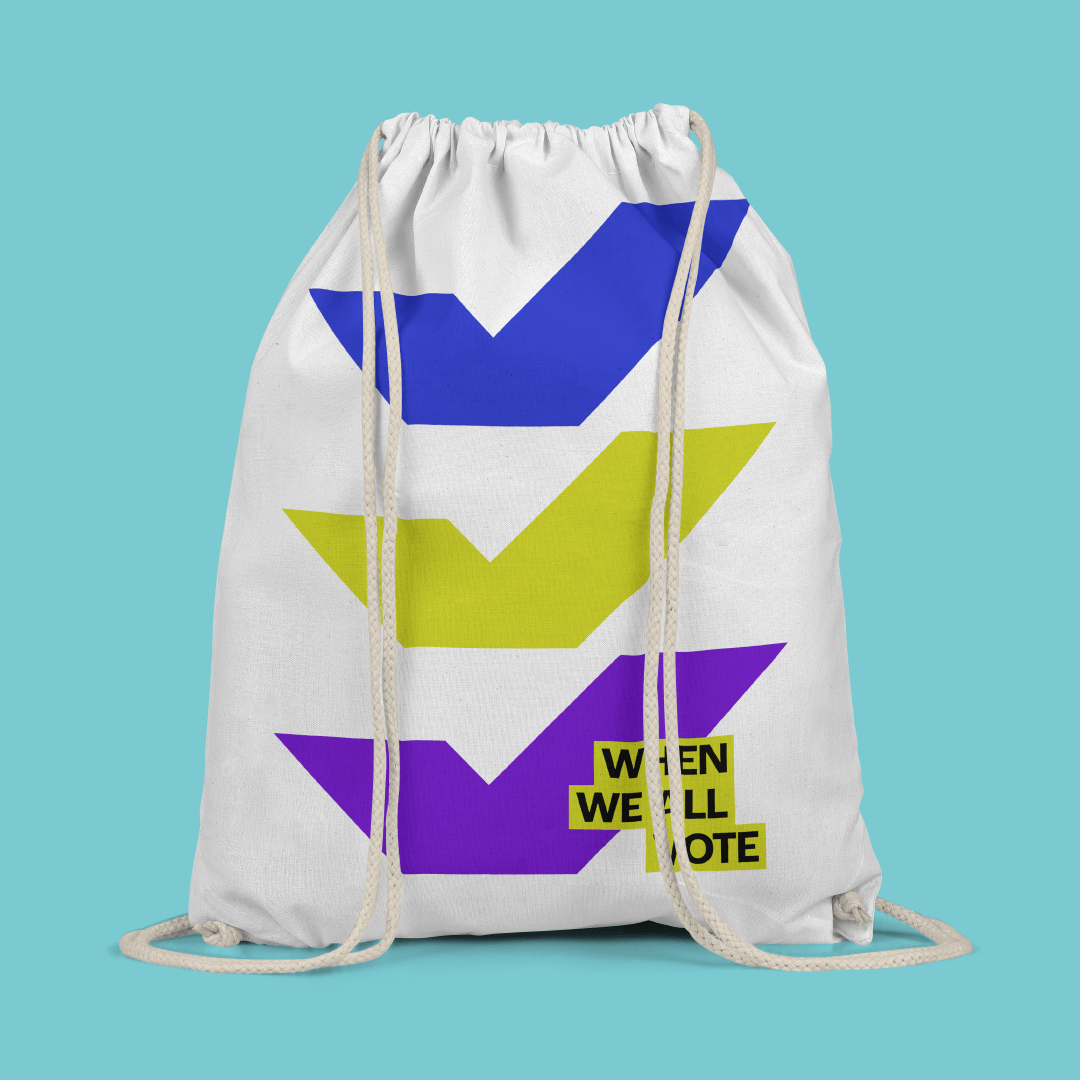
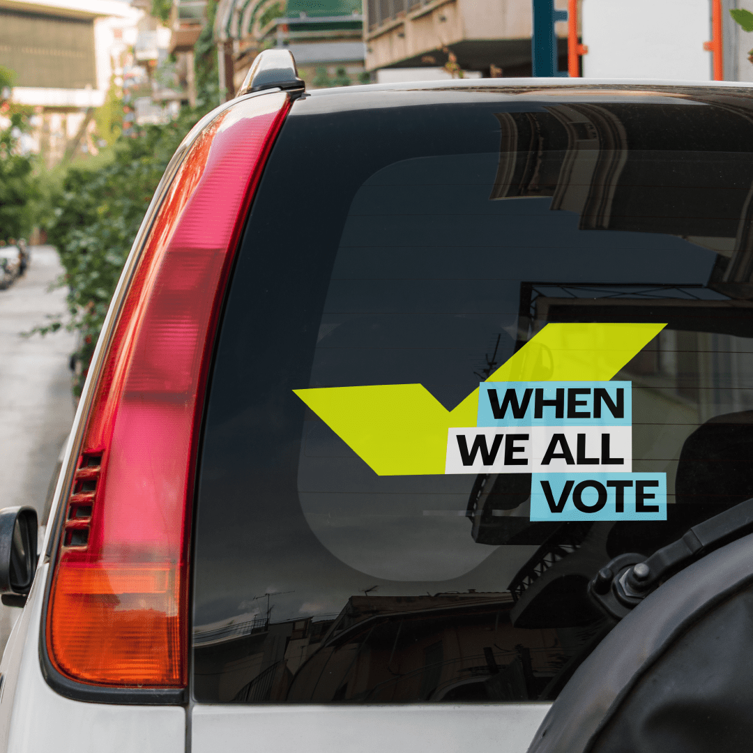
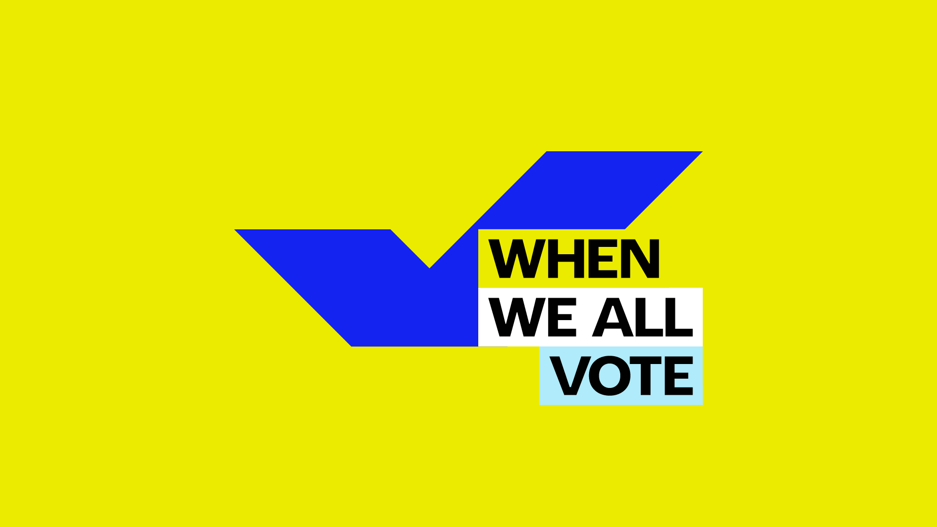
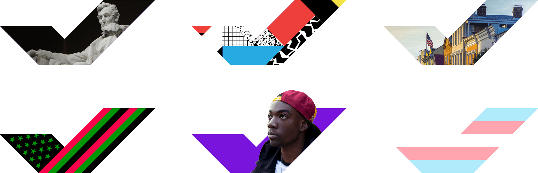
One of the higher level design directives our team adhered to was an avoidance-at-all-costs of any cliched election imagery: ballots, stars and stripes, hanging chads, and so on. We felt like, on top of being too easy to ignore, this sort of iconography was decidedly backwards-looking and ran counter to the narrative of building a bright future. While honoring and learning from history is crucial for a functioning society, there’s a real danger of nostalgia limiting political imagination and delaying real progress. With all this in mind we created a simple, graphic mark that could live alongside our fledgling design system. The check mark icon was a way to take a gesture symbolic of the electoral process and turn it into something sleek, contemporary, and ownable. It can exist on its own or it can be a container for imagery, patterns, colors, or whatever it may need to be. Like our color palette its designed to be flexible, fluid, and most importantly, readable.


-
©
Peter Dommermüth, 2016–2021.
Unless otherwise noted, all images on these pages are copyrighted.
Peter Dommermüth, 2016–2021.
Unless otherwise noted, all images on these pages are copyrighted.