IDENTITY
MOVEABLE TYPES 2030
Moveable Types 2030 is a fictional visual identity for a retrospective exhibition on the history of typography, presented by the Cooper Hewitt Design Museum in the year 2030. It’s both an exercise in speculative branding and an attempt to use the limited language of graphic design and design fiction to try to understand something about where our culture is headed based on what it seems to value today.
The set-up for this project is simple: design a visual identity for an exhibition held by a credible and well respected cultural organization, but with a twist: it doesn’t actually exist and it takes place in the year 2030. In this respect, the “design” and “branding” is really an excuse, or maybe more accurately a language, through which we can both ask questions about today and map those answers onto a possible tomorrow.
In the case of Moveable Types, what we’re asking is: “how do we treat our cultural institutions?” And more broadly: “as a society, what do we value?” “What does that end up costing us?”
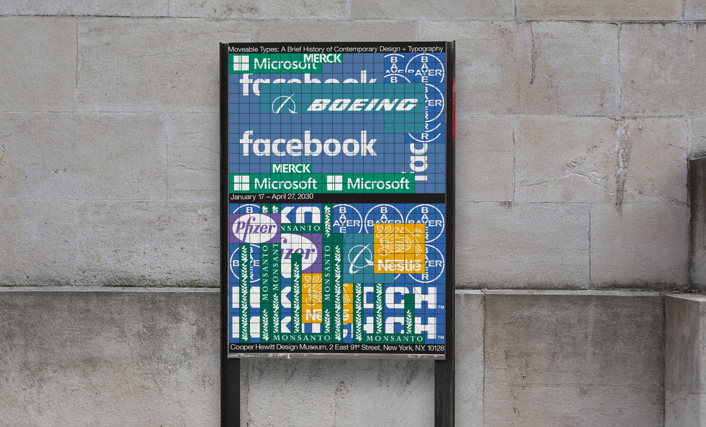
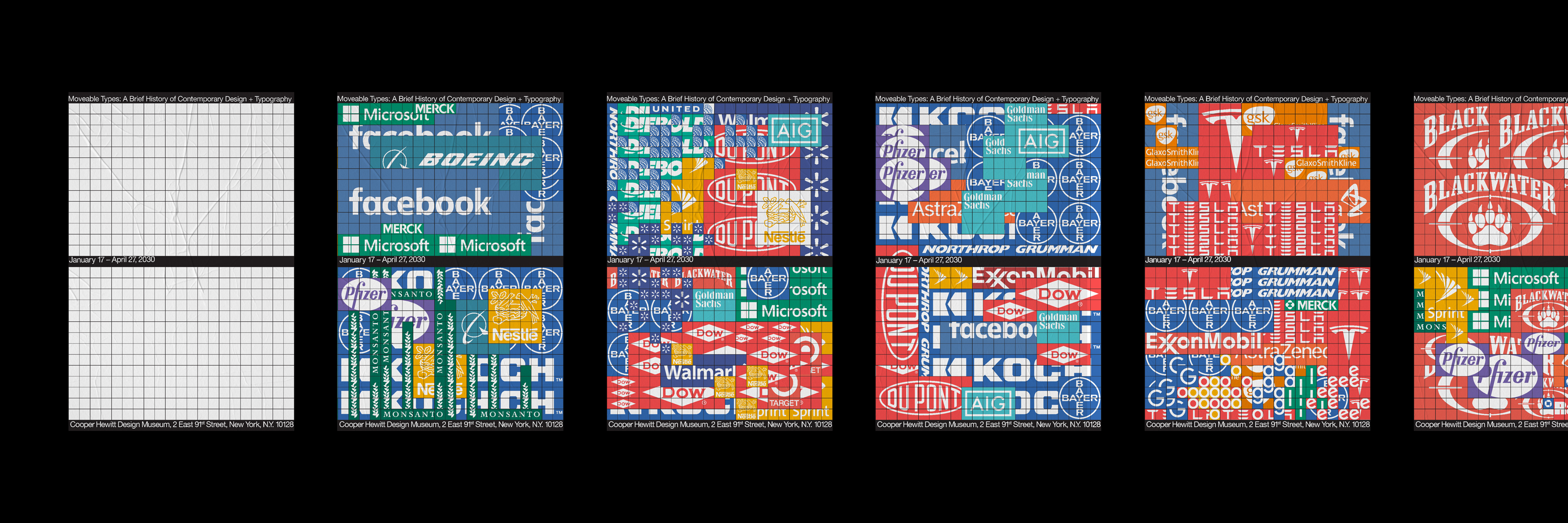
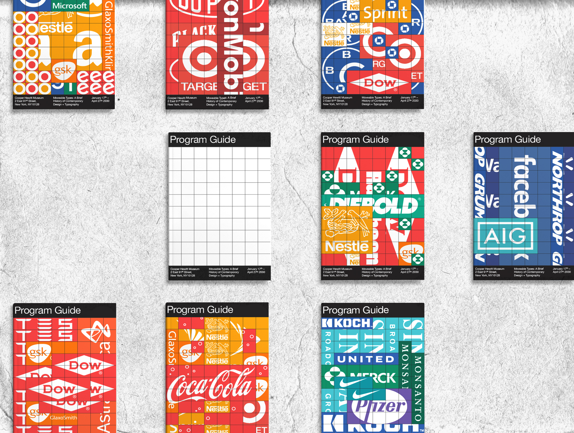
The Moveable Types identity envisions a world where funding for the arts and the institutions that preserve and present it continues to dwindle. Widespread austerity and privatization is the name of the game and cultural institutions have to work overtime groveling for patronage and corporate sponsorships. This is the basis for Moveable Types’ gaudy, radical riff on a visual identity; something hollowed out almost completely, leaving room only for advertising, save for small strips of black space for what little information can still exist within all the clutter.
In the case of Moveable Types, what we’re asking is: “how do we treat our cultural institutions?” And more broadly: “as a society, what do we value?” “What does that end up costing us?”
The Moveable Types identity envisions a world where funding for the arts and the institutions that preserve and present it continues to dwindle. Widespread austerity and privatization is the name of the game and cultural institutions have to work overtime groveling for patronage and corporate sponsorships. This is the basis for Moveable Types’ gaudy, radical riff on a visual identity; something hollowed out almost completely, leaving room only for advertising, save for small strips of black space for what little information can still exist within all the clutter.
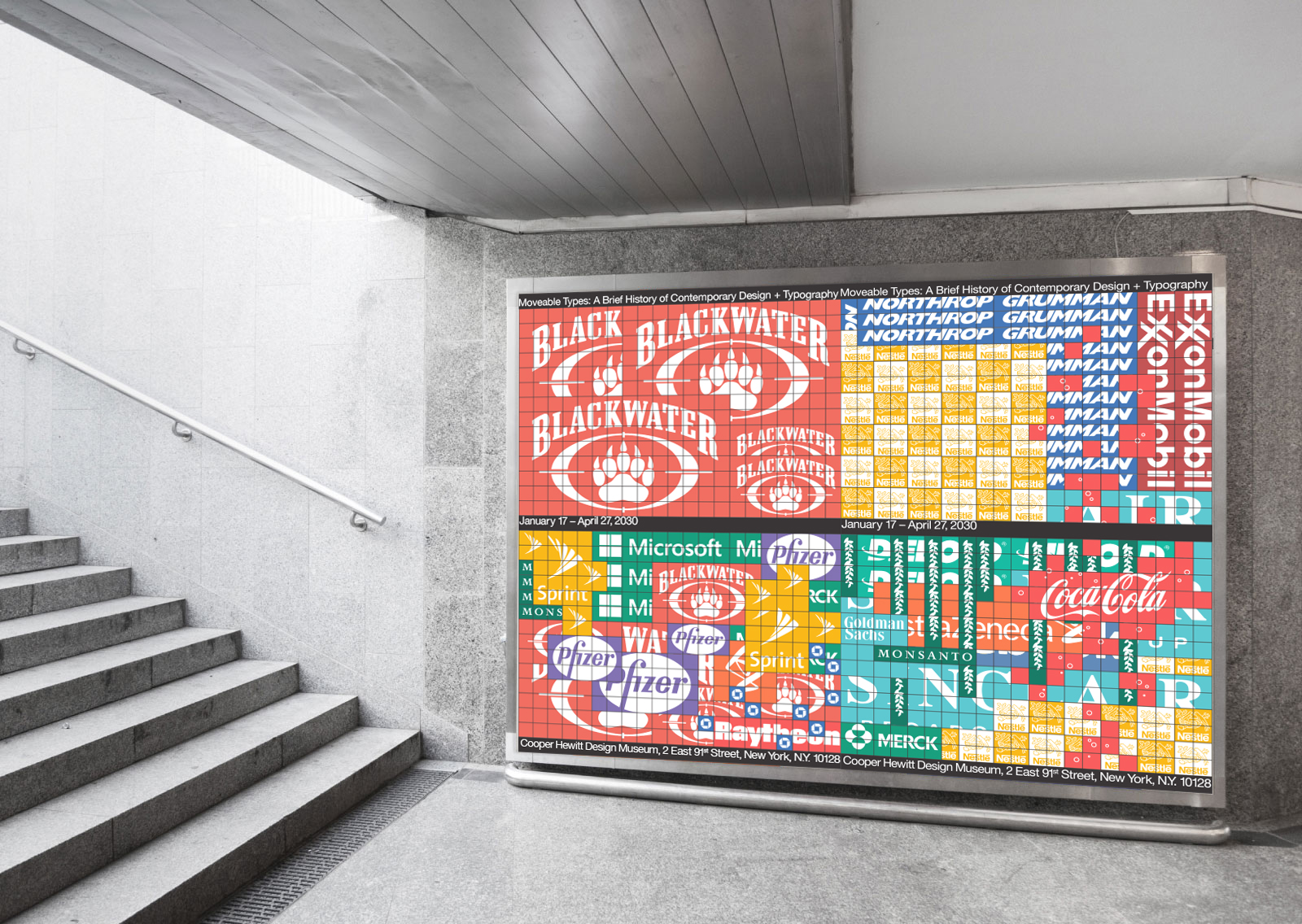
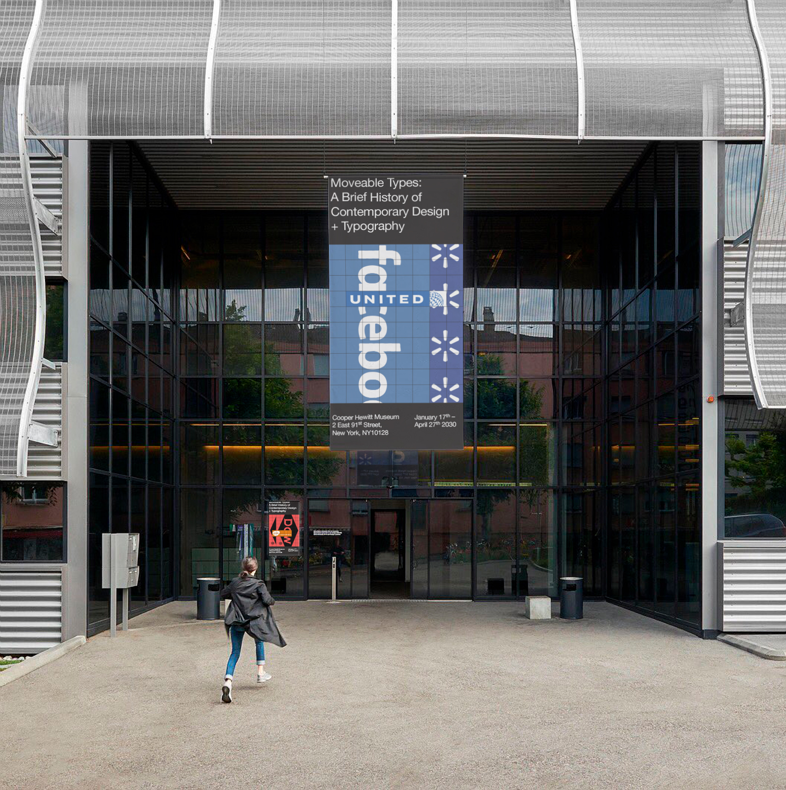

Moveable Type’s advertising placement system is based on a simple square-cell grid whose size and number of cells can flex depending on the application. Any cell can be had for a flat rate and a premium can be paid to overlap another patron, however the exact placement/grouping/lack thereof is left up to a team comprised of curators, organizers, museum staff, and volunteers. The only information that team has to strictly adhere to is the amount of grid real estate “owned” by each patron across each application, but everything else is up to their aesthetic judgement. Almost all of the available visual real estate across posters, ID lanyards, tickets, exhibition guidebooks, signage, etc. is given over to advertisers and patrons but in exchange a different kind of agency is given back to the cultural institution. It’s a small, ultimately symbolic act of defiance against rising corporate feudalism.
Inspired partly by quilts sewn together from discarded bits of fabric, and partly by bio artists painting with bacterial colonies, this system is ultimately rooted in a pure collaboration between two opposing forces, repurposing the cultural detritus of logos and branding into something (hopefully) more culturally significant.
Inspired partly by quilts sewn together from discarded bits of fabric, and partly by bio artists painting with bacterial colonies, this system is ultimately rooted in a pure collaboration between two opposing forces, repurposing the cultural detritus of logos and branding into something (hopefully) more culturally significant.
-
©
Peter Dommermüth, 2016–2021.
Unless otherwise noted, all images on these pages are copyrighted.
Peter Dommermüth, 2016–2021.
Unless otherwise noted, all images on these pages are copyrighted.